Thursday, 30 December 2010

The Artisan Food Trail

Having already created the logo and identity, we're currently working on The Artisan Food Trail website (www.artisanfoodtrail.co.uk).

Here's what we can tell you about them until the website is live:

The Artisan Food Trail is a unique and affordable online marketing service for artisan food and drink producers offering them the opportunity to be seen by foodies, chefs, restaurants and local outlets alike - all who want to buy their products.

The Artisan Food Trail exists because producers want to increase awareness of their products to their consumers.

For a comprehensive and unique online presence including:

  • Company logo
  • Company profile
  • Photos and product images
  • Contact details
  • Links to your website (if applicable)
  • Links to your social media pages
  • Placemarker on Google Maps
  • Monthly entry update
  • Featured producer opportunity
  • Plus additional optional services

Contact The Artisan Food Trail today for more details: info@artisanfoodtrail.co.uk

More info from us as it becomes available.

Monday, 22 November 2010

More Testimonials...

We've been producing some work for Jen Tiller of Reality Quest.

Jen is a therapist, training provider, author and speaker specialising in well-being and resilience.

Her latest project is: "The Resilient Therapist", a programme of workshops and resources to support therapists and actively prevent burnout. Resources include books, posters, relaxation CDs, and artwork for peaceful spaces (see Jen's blog for e-commerce links).
To find out more, visit her website  - www.jentiller.com

To find out what Jen had to say about us - View her testimonial

Portfolio

A few examples of work produced by the designers at childsdesign has just gone up on the portfolio page.
Go to the Portfolio page above and simply click on what you'd like to see.

Sunday, 21 November 2010

Social Media and Business

  • How many businesses start using social media as part of their marketing and then stop using it as quickly as they started?
  • Have you used social media and what results has it given you - if any?
  • What did you expect to happen using social media and how quickly did you expect to get the results you were after?
  • What platforms did you use?
  • Did you (or someone in your office) set up your social media presence, maintain, update and post?
  • If you didn't get the results you wanted, do you see it as 'just a waste of time and resource' or would you try and use social media again?
  • Would you outsource your social media marketing for a small monthly fee?
  • We'd really like to understand why you started and why you stopped, and we'd also really like to hear from artisan food producers who have thought about social media as a part of their marketing but haven't gotten any further than that thought.

Wednesday, 20 October 2010

Food Glorious Food

We've been working on yet more food.
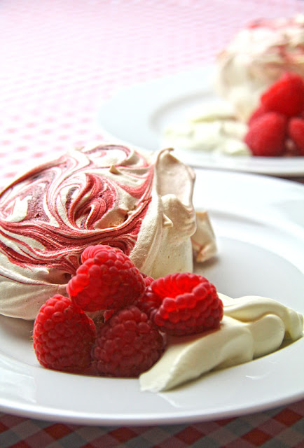
Here are a handful of images that we've created over the last few weeks for you to salivate over...


Tuesday, 28 September 2010

Just before...

...we start our typography basics series, we thought we'd slip in a couple more food images for you.


Still hungry for more?
If you'd like to talk to us about some images of your produce or products, please do drop us a line.

Tuesday, 21 September 2010

Type Matters: New series on typography basics


Over the coming weeks, we’ll be looking at typography. Just some little things that need to be observed to ensure good looking, easily read and well set out type.

The use of type is so important, after all, its main purpose is to communicate your message, so why make it difficult for people to understand or just plain ugly to look at?

There are a few simple rules that can make all the difference in conveying the right image, some may seem pretty obvious to most, but there are still some type crimes being committed – we think you know what we mean.

Headline or display typography may be the first thing you think of when making something look good, but just as important, body text must be well presented, as often this can let down the whole design and readability.

So, are you, or do you know, a saint or sinner?

Monday, 20 September 2010

Monday, 13 September 2010

We love food

Amongst the many things that we enjoy at childsdesign, we really enjoy working with food.
Here are one or two images that we've recently produced.


Wednesday, 25 August 2010

Our reputation grows further

We've recently been working with Lia Parkinson from
The Office on the Net.
Take a look at what she had to say about us on our testimonials page.
If you're in need of an extra pair of hands for your growing business we'd also like to point you at Lia's website (The Office on the Net).
Lia specialises in working with professionals, entrepreneurs, small businesses and start-ups that need assistance with administrative tasks that eat into your time and stop you from building your business further - visit the website to find out more about how she may be able to help you.


Monday, 23 August 2010

Customer Care

At childsdesign we try to look after our clients and we'll move mountains to help them if we can (we've got a large crane out the back).
If you don't already know about us, why not find out why everyone is saying what they are.
Read our latest testimonial here

Tuesday, 10 August 2010

Happy Clients

A testimonial from another of our clients, Eirian Baker of Genesis Thinking.
Have a look and see what they and some of our other clients have to say about us.
Read our testimonials


Sunday, 16 May 2010

What People are Saying About Us

Read for yourself what people are saying about childsdesign's creativity, quality and service.
http://childsdesign.blogspot.com/p/testimonials.html
Or even better, why not give us a call, book in your next job and see what all the buzz is about for yourself.

Saturday, 15 May 2010

Design Tip: Read It 60/40 Rule

Yesterday I attended a fantastic training course. 
As with most training courses it was accompanied by a powerpoint presentation, again, a fantastic presentation.
The only thing that let it down was when the attendees shouted, "I can't read that", to the presenter, as one slide came up.
Admittedly, only one slide of 50, but it had created a negative, in what was a very positive up-beat presentation.
This isn't the first time that I've encountered this in a presentation.
I have seen (or not) presentations that have been the exact reverse with 49 of the 50 slides completely illegible.

The problem was simply the presentation of text on a tinted background or panel.
It's a simple thing to sort out and as many of you produce your own powerpoint presentations, I thought I'd share a solution with you.

The 60/40 rule

It's not complicated.
It's not a thing that only 'designers' can do.
It's something that can easily be corrected in just about any presentation software.

Simply, the 60/40 rule works in this way:

Black text = 40% tint background
White text = 60% tint background

This same rule will work for colours too.

Dark coloured backgrounds = 40% tint
Light coloured backgrounds = 60% tint

I've put together an example sheet to show how this works


As always, we're here to help if you need us.

Presentations – they're all just childs play

Wednesday, 5 May 2010

Design Tip: PDF Forms

What do you mean 'you've never heard of them!'.

A simple and easy way to turn your paper forms into email-able forms that can be filled in and returned in the same way – no faxes and no illegible handwriting. What's more you can import the data into a spreadsheet without typing a thing.

We know how to produce these, so why not ask us how they might be able to make things easier for you.

PDF forms – they're all just childs play.

Monday, 19 April 2010

Design Tip: How many different fonts?


  • Limit the number of typefaces you use in any one job.
  • The more fonts you use, the more your message is diluted.
  • Use different weights, but don't over do it.
  • Use different sizes, but don't over do it.
  • Use italic or bold to add emphasis and expression.

Typography is an art form in itself.
Not every design company gets it right.
We're here to help.

Friday, 9 April 2010

Jewellery Images

Now the site has gone live we can let you see the images that we've been working on. childsdesign have been involved in creating all of the product images on the website.
If you're looking for quality images of your jewellery products at a sensible price, then please contact us as we're sure to be able to create something similar for you.

www.anonjewellery.com

See the Facebook album

Sunday, 21 March 2010

Inspiration and Wonder

At childsdesign we're always on the look out for places to find interesting and unusual props for client photo shoots, as well as things that fill us with inspiration and ideas for our next design project.
We've just discovered a new local source of inspiration and wonder – Wunderkammer!
Hidden in the village of Arlesey, Bedfordshire is an amazing Aladdins cave of 'stuff' just waiting to be picked up and used in a whole host of different ways.
Baskets, boxes, toys, books, plates, bowls, clocks, mirrors, musical instruments, tables, chairs, animal skulls, space-hoppers – you name it and it's probably there, if it's not, then just pick up a box and it's probably hiding underneath.
If like us, you love 'things', then we'd recommend that you visit this magical cave and see what it may have for you (just don't buy all of our props while you're there).
Wunderkammer isn't open everyday, so visit their blog for info – www.wunderkammershop.blogspot.com

Sunday, 14 March 2010

Business Link Vouchers

childsdesign are registered with the Business Link Supplier Brokerage Service.
This means that if you're a new start business and you've attended any Business Link course you can come to us with the vouchers that they give you once you've completed the course.

The vouchers can be used for advice or as part payment to the first job we produce for you.

To add to the value even further, we've put together some great flexible packages to get you off to a good start. Your identity is important, and we want to make sure that you are presented to your clients in a professional manner right from the start.

If you already have an idea in your head and you'd like us to help you get this onto paper (or a website), we can do that for you. If you have a company name and really don't know what to do next, we can help you with some ideas to get your company identity up and running.

Once we've got your identity sorted we can help with brochures and direct mail. May be you have product you sell and you want to put together a catalogue to get out to your prospective customers, maybe you need an e-commerce website - we can guide you through everything you'll need to do to get the best results at the best prices.

Please take a look at our website: www.childsdesign.com, to see the basic packages we've put together and give us a call or drop us an email (info@childsdesign.com) if you'd like to find out more - we won't give you prices until we've had time to meet with you and discuss exactly what you want or need.

“childsdesign has significantly contributed to the successful rebranding of Alton Greenhouses and Robinsons Greenhouses. Their creative expertise has enabled us to display complicated information in an easy to read style. First class design expertise!”
Neil O’Sullivan - Marshalls PLC

We don't believe in giving out quotes that we can't keep to and will lead to additional costs at the end of the job. We do believe in being honest and fair to all of our clients, so we'll tell you if we think you're wasting your money on things you don't need and help you with the things that you can do for yourself.

"We always leave our creative design requirements to the last minute and because of this our project briefs always start with "we haven't got much time on this". Part of this is childsdesign's doing as they always meet our tight deadlines and exceeds our expectations with regards to their creative direction"
Steve Harris - Harris and Jones

Our client testimonials speak for themselves, so why not get in contact now?

Saturday, 27 February 2010

Our Services

The list of our services can be as long or as short as you wish.

You might only need a quick leaflet putting together or you might need a 60 page brochure with full location photography, art direction, artwork and retouching - we’re here to make your life easier.

• design
• art direction
• branding
• marketing
• photography
• copywriting
• artwork
• creative retouching

About childsdesign

Based in North Hertfordshire, childsdesign is not your usual run-of-the-mill full service creative and marketing solution.

Our aim is to genuinely offer our clients and prospective clients the solutions that are right for them - this means that we actually listen to what our clients have to say about their needs and tailor our creative strategy to them.

We strive to build on our client relationships by offering solutions that will surpass their expectations, save on their budgets and hopefully, have some fun along the way.